looks beautiful to me.nillyhan said:
First let me give some example screenshots of what kind of line-art I am talking about exactly.
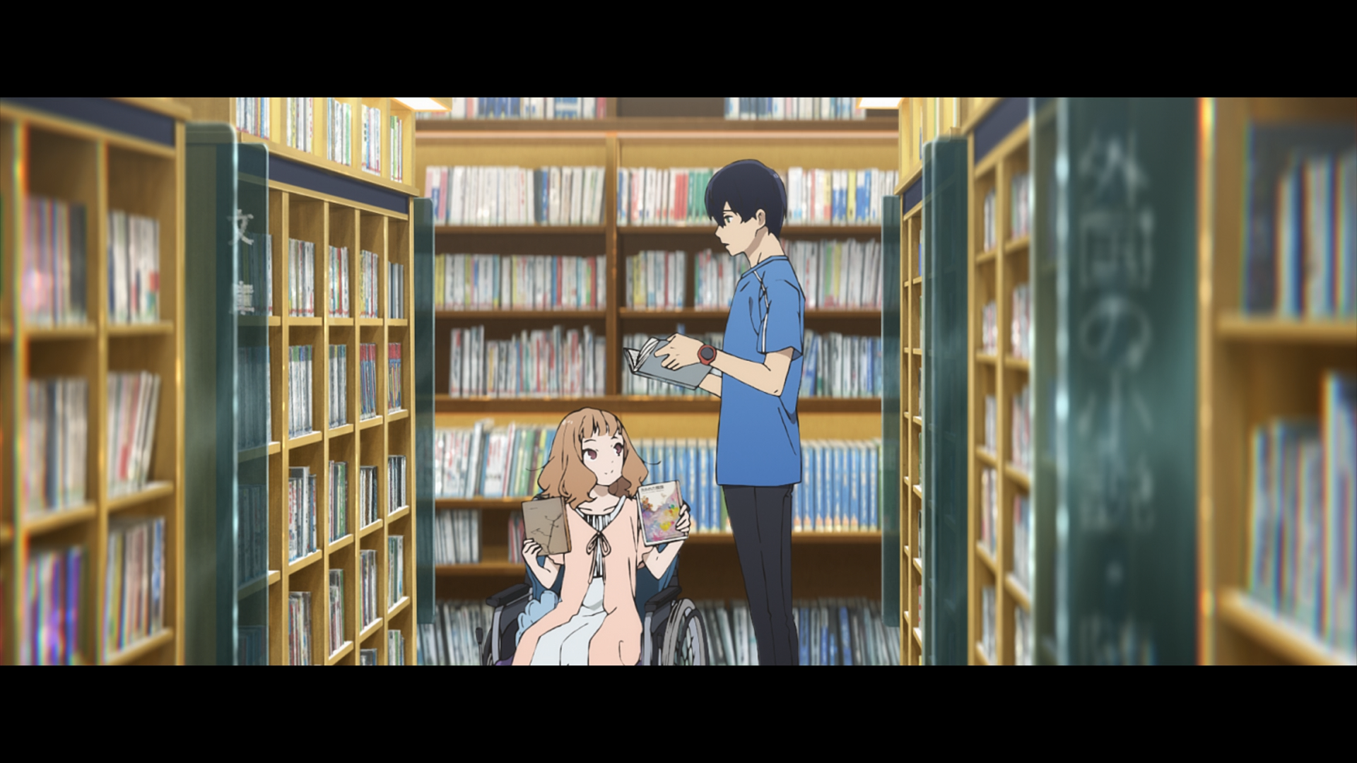
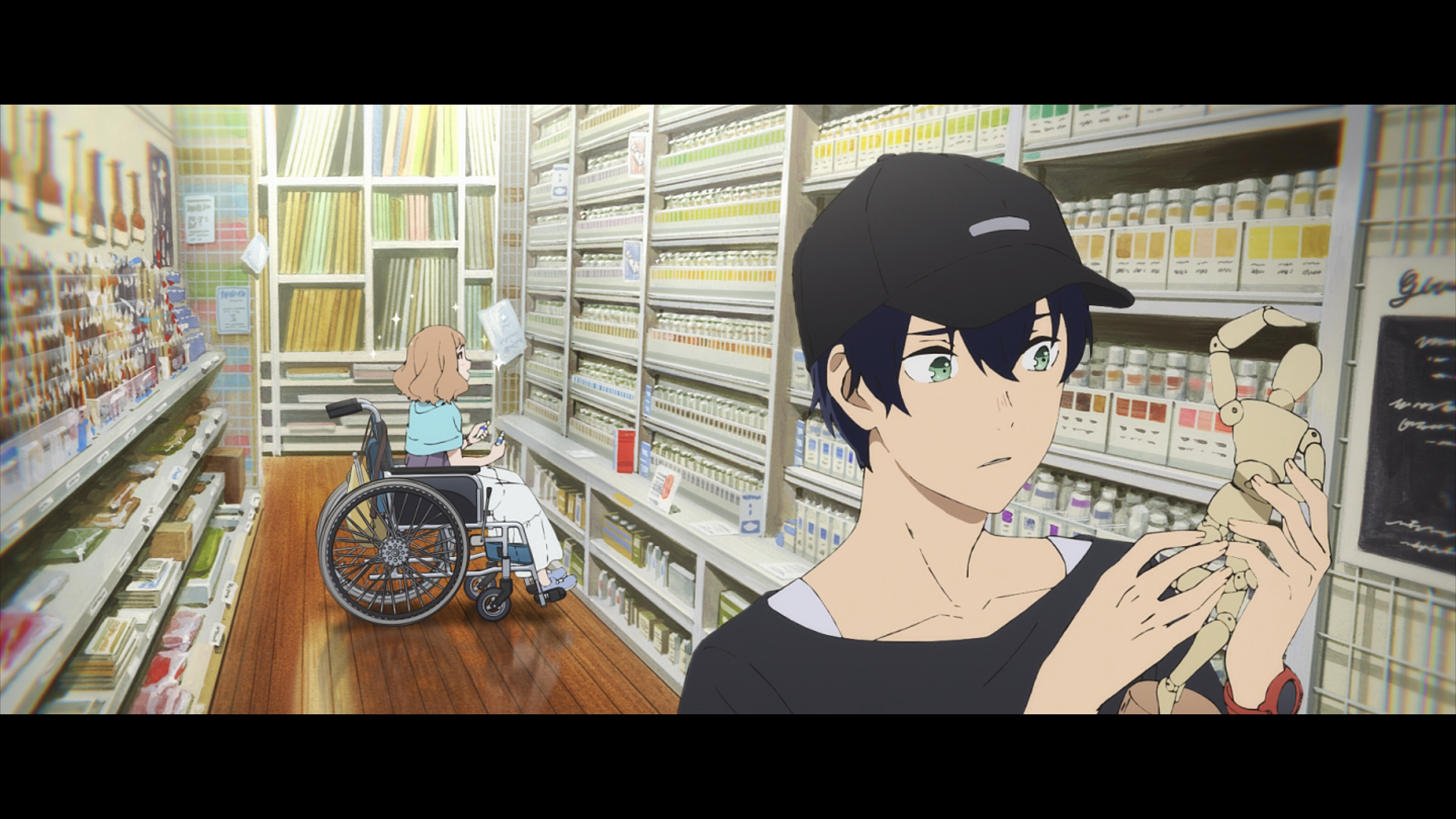
These two screenshots are from josee, tiger and fish.
https://i.kek.sh/iF3KyT8tlY2.png
https://i.kek.sh/KtwSpgDhUII.png
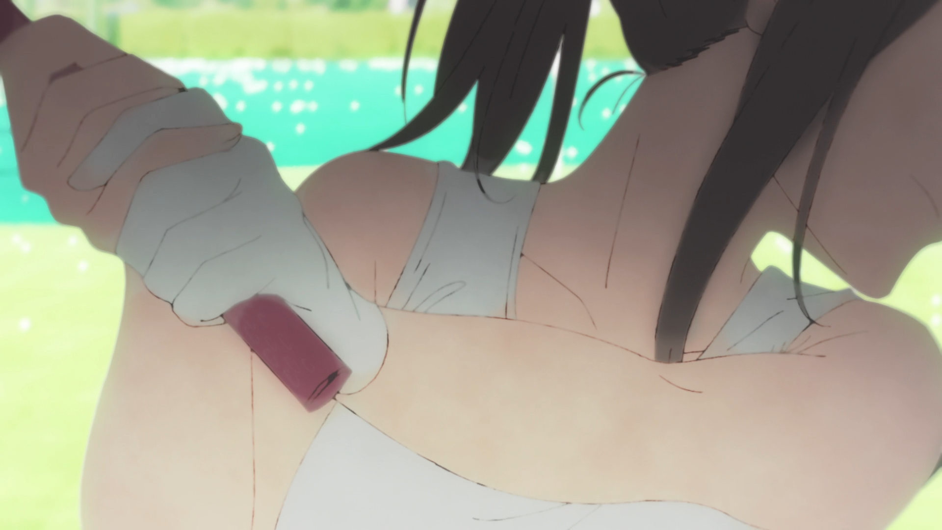
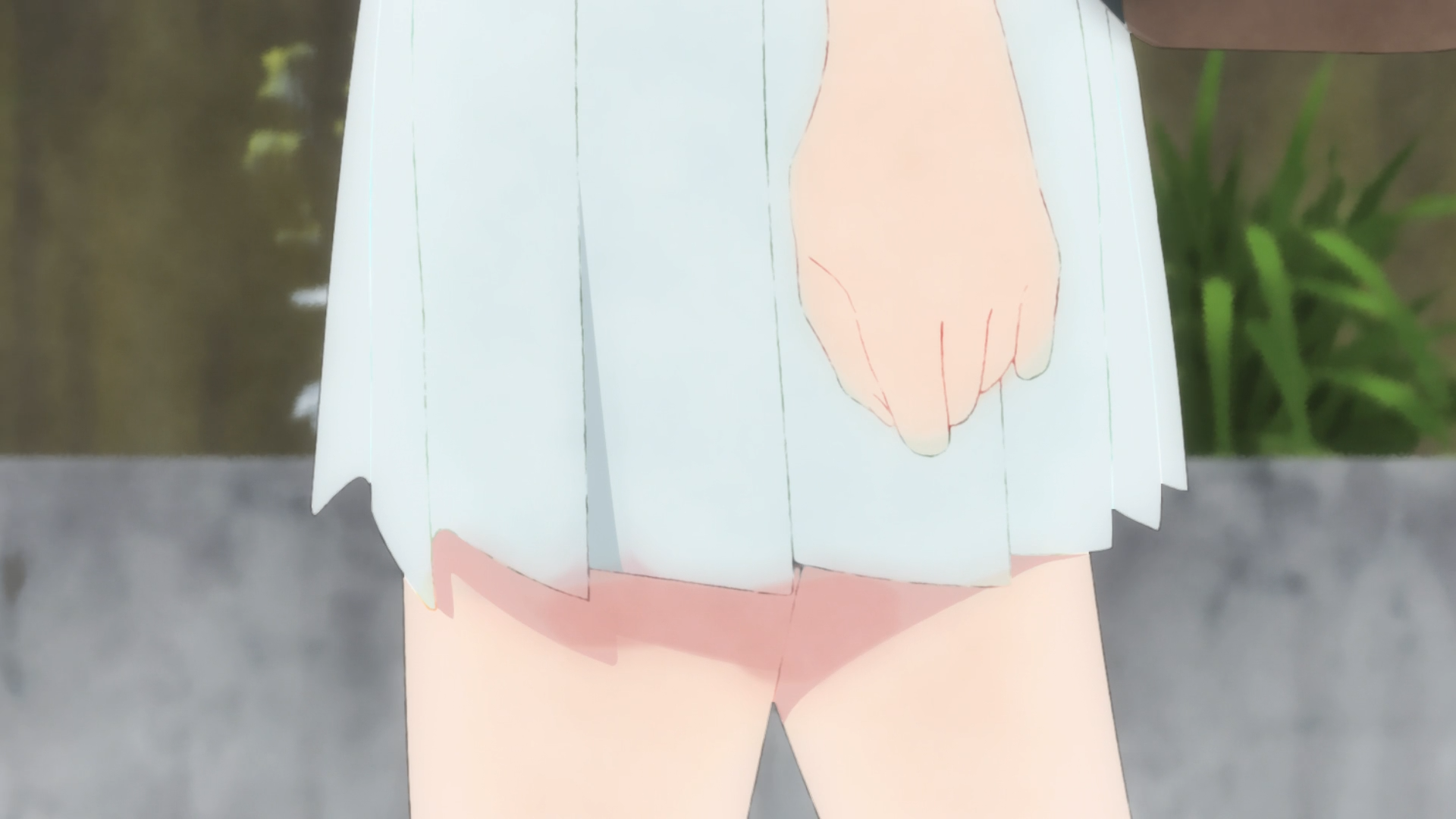
These two are from sorairo utility.
https://i.kek.sh/umsOHPfJJVV.png
https://i.kek.sh/I1oFPTnPkDj.png
Following two are from サイダーガール ''melt'' short movie.
https://i.kek.sh/Jhe48QYHm5o.png
https://i.kek.sh/r9xgR0W31g9.png
All of these have somewhat messy (not sure what exact term to use tbh) black line-art, in some places there's more ink and in some places there's less ink.
What's the reason behind the making of such line-arts? Like, is this some artistic decision, problem with graphics software or something else? And if this is a style, when/where did this first start and who started it? Can't say about the other two, but the first screenshot from josee looks so disgusting that it's kind of hard to think that was an artistic decision.
I'm personally more interested in how it's made. vfx during composting? during clean up? during coloring?nillyhan said:
First let me give some example screenshots of what kind of line-art I am talking about exactly.
These two screenshots are from josee, tiger and fish.
https://i.kek.sh/iF3KyT8tlY2.png
https://i.kek.sh/KtwSpgDhUII.png
These two are from sorairo utility.
https://i.kek.sh/umsOHPfJJVV.png
https://i.kek.sh/I1oFPTnPkDj.png
Following two are from サイダーガール ''melt'' short movie.
https://i.kek.sh/Jhe48QYHm5o.png
https://i.kek.sh/r9xgR0W31g9.png
All of these have somewhat messy (not sure what exact term to use tbh) black line-art, in some places there's more ink and in some places there's less ink.
What's the reason behind the making of such line-arts? Like, is this some artistic decision, problem with graphics software or something else? And if this is a style, when/where did this first start and who started it? Can't say about the other two, but the first screenshot from josee looks so disgusting that it's kind of hard to think that was an artistic decision.
also, I think it looks nice
In general, lines like these are generally done in the composition phase (撮影).
It would lead to problems when sending douga overseas (like almost all douga is these days).
One Piece's current Wano arc's lines are also handled in composition.
When stuff was done analog, douga would straight up be burned (I don't know the technical terms here) onto cels, leaving the actual pencil lines, and thus more of a hand-drawn feel like the examples you posted. (The process is at 14:20 in this video https://www.nicovideo.jp/watch/sm5738253 )
Since its all digital from 仕上げ onward now, lines have to be aliased because using the color fill tool with anti-aliased lines is unnecessary work when coloring. Any effects are applied only when it comes to composition stage.
yes, nowadays is handled in the compositing stageadaroo said:
I'm personally more interested in how it's made. vfx during composting? during clean up? during coloring?
also, I think it looks nice
one method I found out to work is (in this order):
-key out the lines (basically have them and nothing else)
-blur them and then fill the background with white (all of this in the same layer F's plugin alphafix is useful for this)
-then put this on top of a black and white texture layer and use "linear light" or a similar blendmode, this way the texture will be shown through the grey pixels of the top layer but not -on the pure black or pure white ones
-then make a solid color (either black or grey, the result depends on the shade))layer on top and use "hard mix" blendmode, this way it clamps values to black and white
the hierarchy would look like this
- solid color (hard mix blendmode)
- blured lines (linear light or similar blendmode)
- black and white texture
all of this should be on a precomposite, then just key the lines of this result and put them on top of the original animation and you get the result
not sure if anyone will ever find this useful tho hope it helps someone out (im not sure if this is the standard method but its a way of doing it)
This type of lineart leans more into manga-style. I think it has it's roots in traditional japanese calligraphy. It ultimately boils down to artistic choice.
Having the line-weight vary a bit makes it a bit less cartoony and more soft, ethereal.
It also makes things feel less rigid IMO. Just gotta feel this one out really and see for yourself what the general vibe is you're getting. To really get a feel for it one thing you could do is take one of the screenshots from your original post and draw solid lines over it and see how different the vibe gets in general.
I think the line artist(s) are in charge of this and I don't believe there's much VFX happening on this end tbh.
I personally like this style a lot too!
nillyhan
Question regarding a kind of line-art
These two screenshots are from josee, tiger and fish.
https://i.kek.sh/iF3KyT8tlY2.png
https://i.kek.sh/KtwSpgDhUII.png
These two are from sorairo utility.
https://i.kek.sh/umsOHPfJJVV.png
https://i.kek.sh/I1oFPTnPkDj.png
Following two are from サイダーガール ''melt'' short movie.
https://i.kek.sh/Jhe48QYHm5o.png
https://i.kek.sh/r9xgR0W31g9.png
All of these have somewhat messy (not sure what exact term to use tbh) black line-art, in some places there's more ink and in some places there's less ink.
What's the reason behind the making of such line-arts? Like, is this some artistic decision, problem with graphics software or something else? And if this is a style, when/where did this first start and who started it? Can't say about the other two, but the first screenshot from josee looks so disgusting that it's kind of hard to think that was an artistic decision.